We use cookies to provide the best site experience.
MAKE YOUR
ANALYTICS
SMART & SEXY
ANALYTICS
SMART & SEXY

Dashboards templates for Power BI
Save Your Time and Earn More
Save Your Time and Earn More
WASTING YOUR TIME WITH ENDLESS EDITS?
Tons of Charts and Tables Instead of Actionable Metrics?


I am analyst, not a designer…
It is a MESS!
Redesign it by tomorrow morning!
Redesign it by tomorrow morning!
I spent 3 weeks for calculations and data cleanup.
Boss demands to redesign reports again and again?


Don’t know how to meet users expectations?
You need time for the real analytics, not for charts polishing
SAVE YOUR TIME!
USE PROVEN UX/UI TEMPLATES
USE PROVEN UX/UI TEMPLATES
SAVE YOUR TIME!
USE PROVEN UX/UI TEMPLATES
USE PROVEN UX/UI TEMPLATES
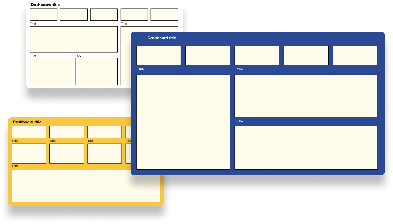
Layouts for any dashboard
Ready to use charts
+
YOUR REPORTS WILL LOOK PROFESSIONAL
Follow our guidelines and make your reports comprehensive.
Get attractive design in 30 minutes!
Get attractive design in 30 minutes!
Follow our guidelines and make your reports comprehensive.
Get attractive design in 30 minutes!
Get attractive design in 30 minutes!
INCREASE VALUE OF YOUR JOB


Your bosses will be pleased with you
Spend less time on reports and you’ll get paid more
No more time wasted on rework.


This report is perfect!

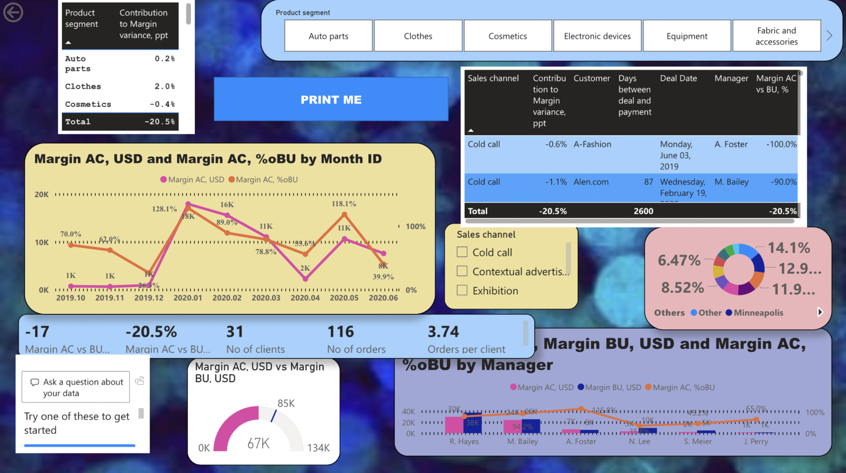
TAKE A TOUR
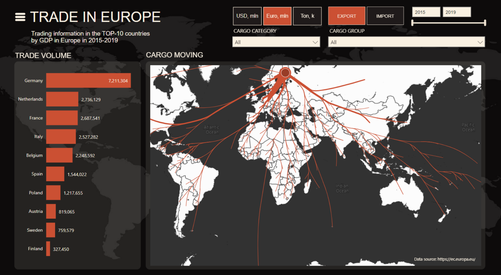
Discover features of the Guideline at this online demo:
layouts for different grid, charts and dashboards examples.
Discover features of the Guideline at this online demo:
layouts for different grid, charts and dashboards examples.
layouts for different grid, charts and dashboards examples.
Аdvanced visualization in Premium version
+15 advanced charts with step-by-step guides, light and dark color themes.
+15 advanced charts with step-by-step guides, light and dark color themes.

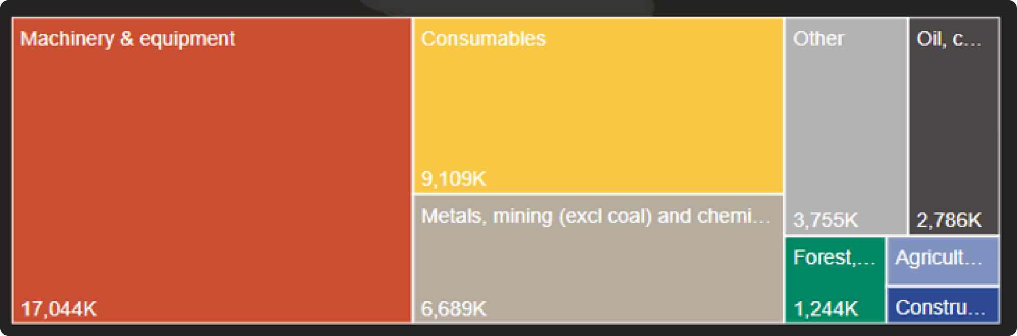
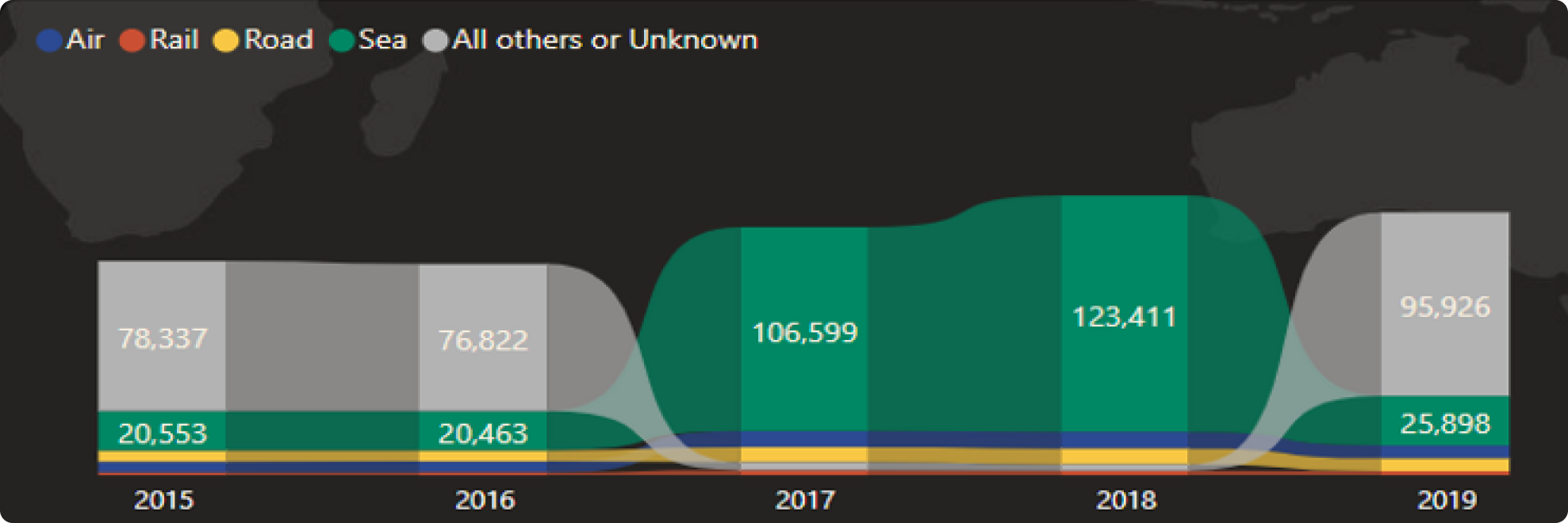
Correlations
Geo analytics
Processes
Comparison
PRICING
About US
Power BI professionals and fans of data vizualisation
Power BI professionals and fans of data vizualisation
300+
reports designed
8500
people trained
14
years in BI


Feedback
from our USERS
from our USERS
FAQ
Yes, our product provides out-of-the-box solutions for the convenience of all levels of users.
Yes, the Guideline is exclusively for Power BI.
With ready-made templates and intuitive tools, you can create a dashboard in 20 minutes.
You will receive a PBIX file, 4 video lectures on how to use it, and a one-hour workshop with practice, after which you will assemble one case study
ANY QUESTIONS LEFT?