We use cookies to provide the best site experience.
MAKE YOUR
DATA SPEAK
DATA SPEAK

Analytics That Really Helps You
Make Data-Driven Decisions.
Use Power BI to Its Full Potential!
Make Data-Driven Decisions.
Use Power BI to Its Full Potential!


Tools:
MAKE YOUR
DATA SPEAK
DATA SPEAK

Analytics That Really Helps You
Make Data-Driven Decisions.
Use Power BI to Its Full Potential!
Make Data-Driven Decisions.
Use Power BI to Its Full Potential!
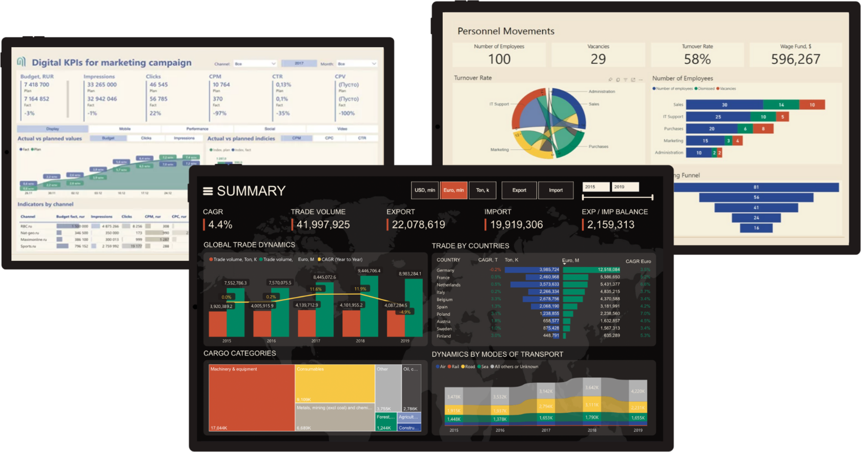
TIRED OF TONS OF TABLES
Instead of Actionable Metrics?
>
Messy Reports
We Make It Clear
WE PROVIDE YOU COMPLEX SOLUTION
You Get 2 in 1
We Сhoose Excel and Power BI to Dashboard Building
Excel has broad functionality and is a standard tool for data processing.
Data hard skills
You will get industry best practices and choose appropriate KPIs and visuals.
We make a turn-key project and take care of all the project stages.
We make a turn-key project and take care of all the project stages.
Power BI provides powerful data visualization and interactive data analysis capabilities, making them an ideal combination for developing analytics skills.
We work with business requirements and translate it into clear data models and ETL processes.
You get reports that managers exactly need, without extra costs for support and rework.
You get reports that managers exactly need, without extra costs for support and rework.
Visual soft skills
training program
I'll take you from 0 to PRO
Advanced course
6. Data Model in Power Pivot
9. DAX calculations
7. Transformations in Power Query
8. Working with queries in Power Query
10. Design, date storytelling, demo session
Mon
Tue
Wed
Thu
Fri
Sat
4 Week
3 Week
Basic course
1 Week
2 Week
Mon
Tue
Wed
Thu
Fri
Sat
3. Data visualization rules
1. Work culture with data
5. Work with requirements
2. The intricacies of summary tables
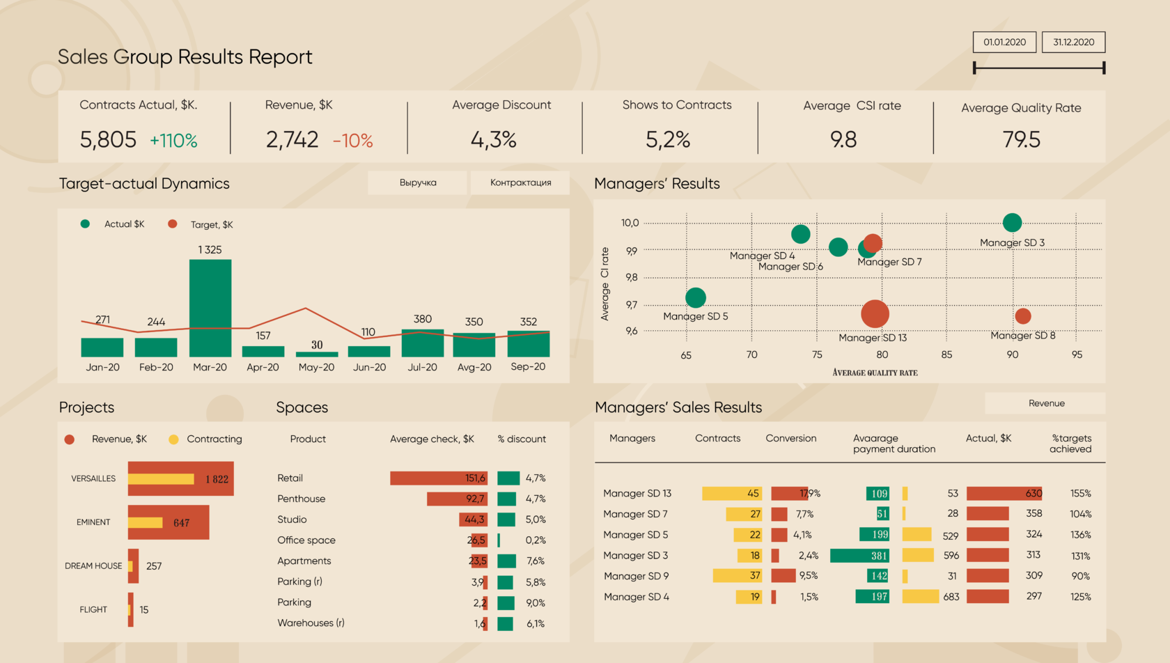
4. Interactive dashboards
Basic course

Best practices of corporate data visualization. Global market trends and domestic solutions.
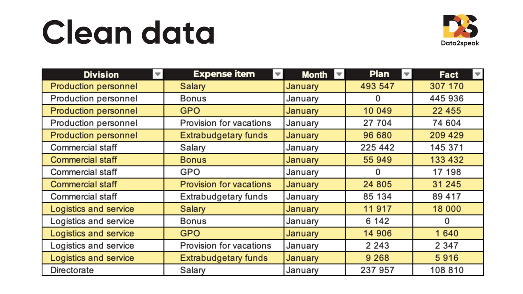
Requirements to format of source data, review of typical errors. Practice on data cleaning.
Practice "Decision-making simulator"
Requirements to format of source data, review of typical errors. Practice on data cleaning.
Practice "Decision-making simulator"
Conversion of ranges into "smart tables", creation of additional calculations, logical control
Summary tables: building rules, setting field parameters, calculations. Customizing data update
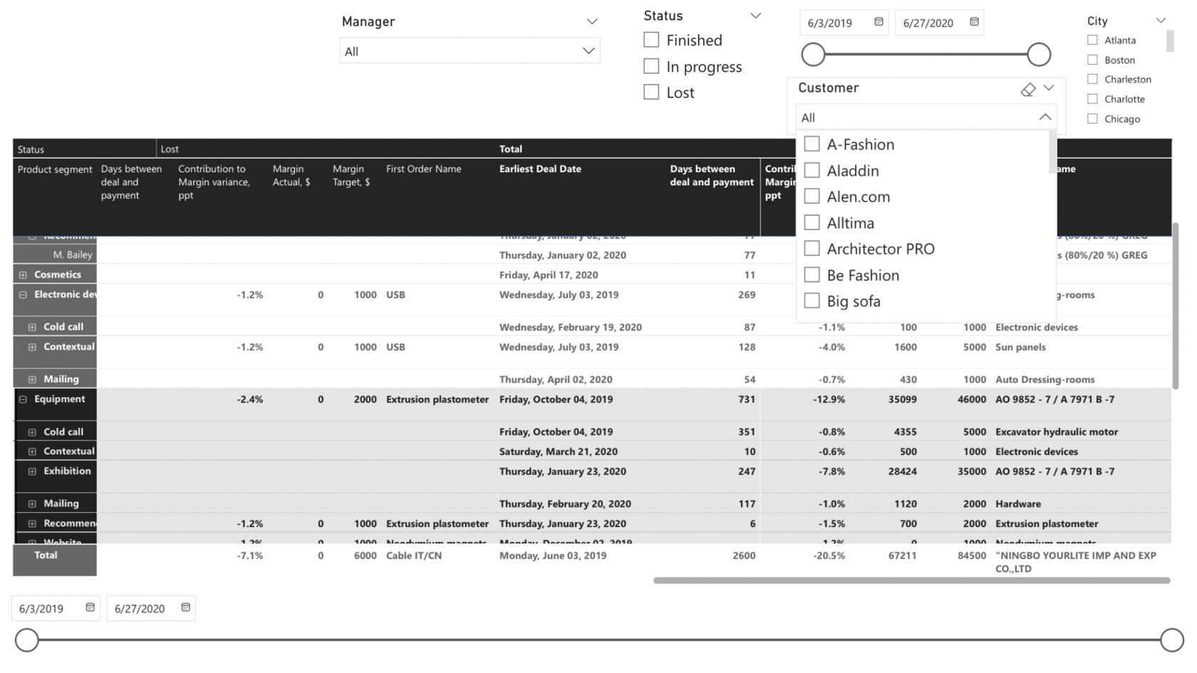
Slices for data filtering, connection to reports.
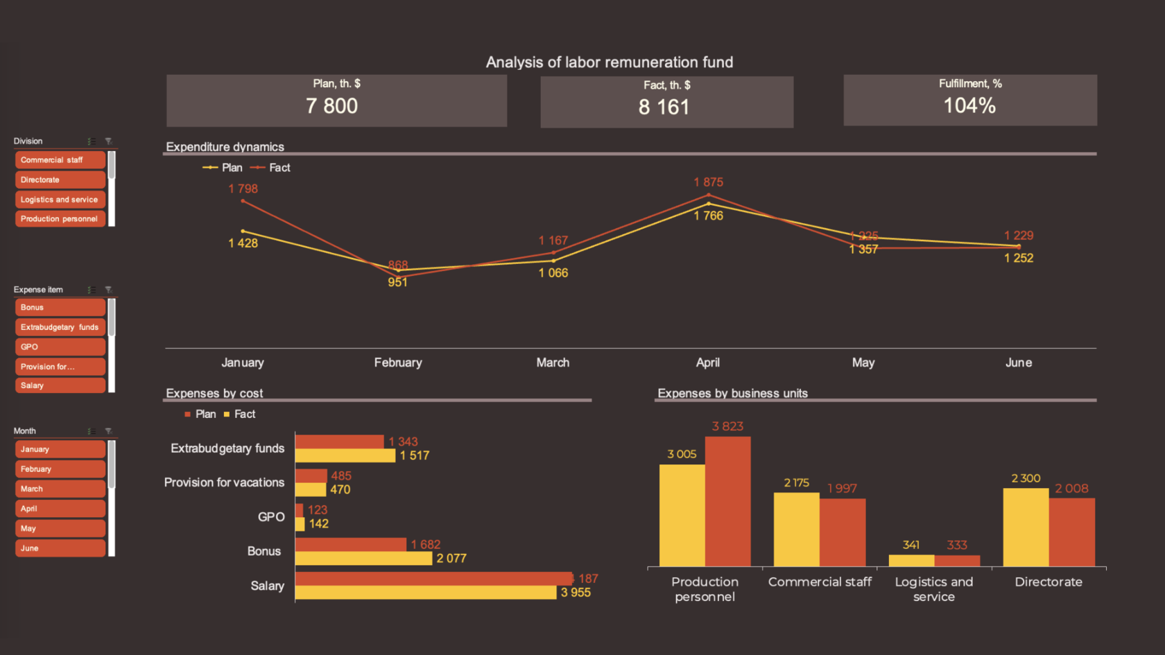
Practice with case "analysis of labor costs".
Summary tables: building rules, setting field parameters, calculations. Customizing data update
Slices for data filtering, connection to reports.
Practice with case "analysis of labor costs".
Types of data analysis and chart selection matrix. Checklist for customizing the design of diagrams, creating templates.
Rules of color coding and accent placement.
Creating cards for totals. Lifehacks of data preparation
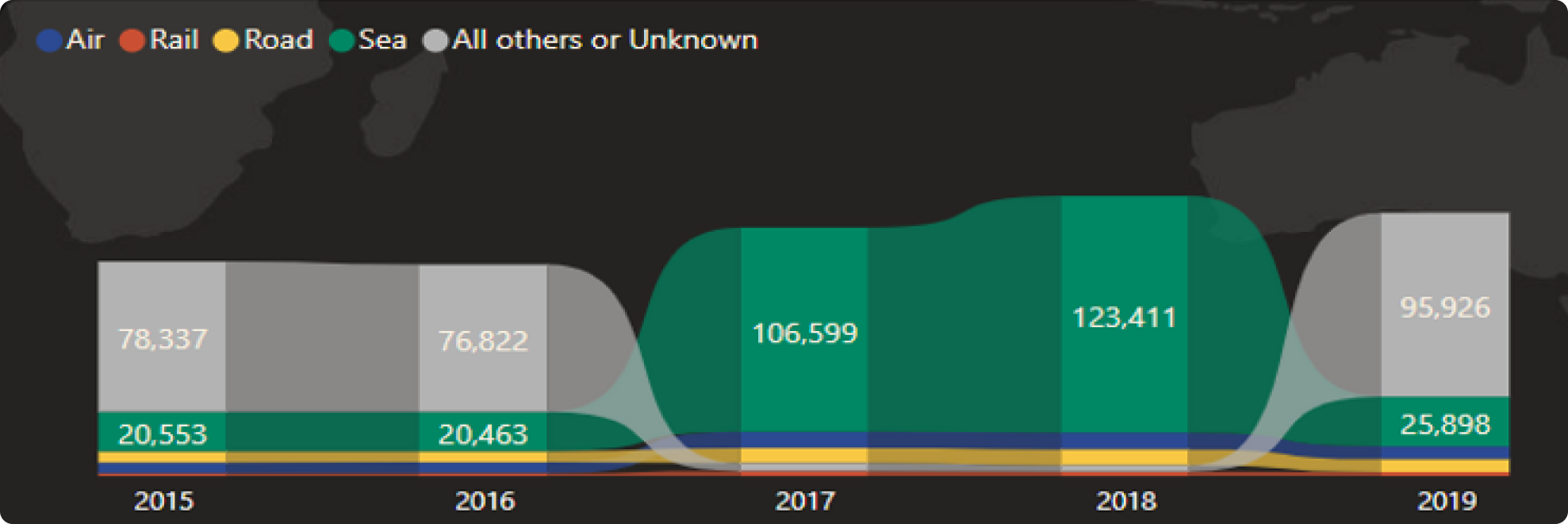
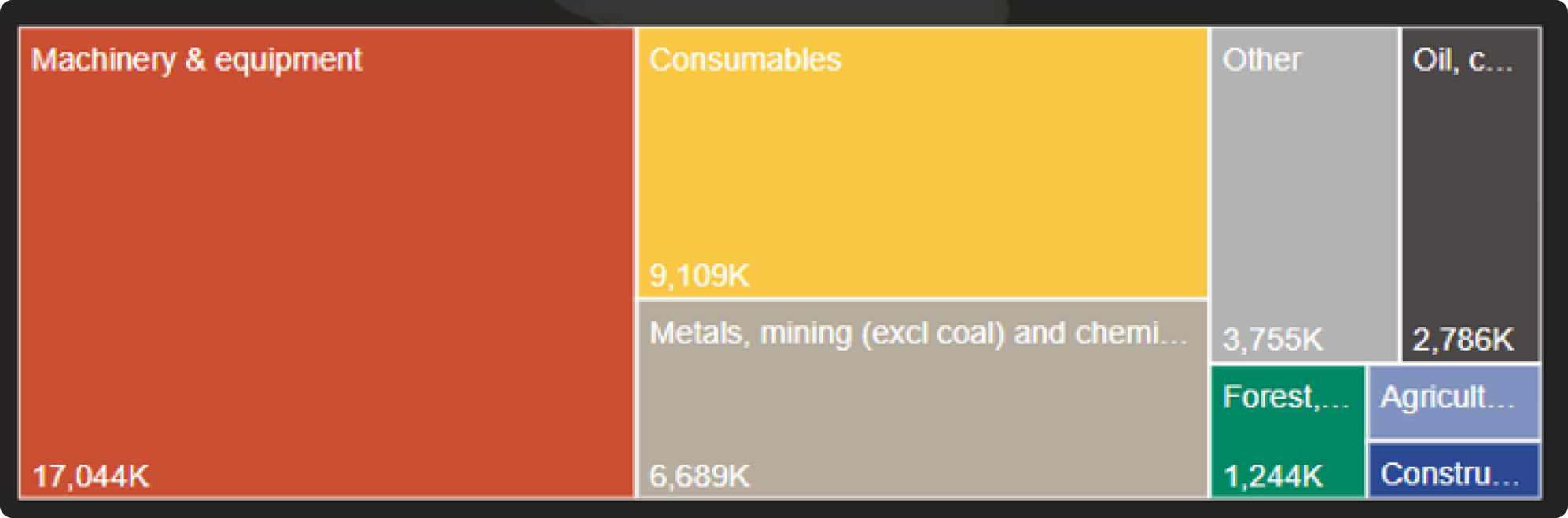
Building non-standard charts: waterfall, trimap, funnel, range, and others.
How to bypass the limitations of summary tables and Get pivot data.
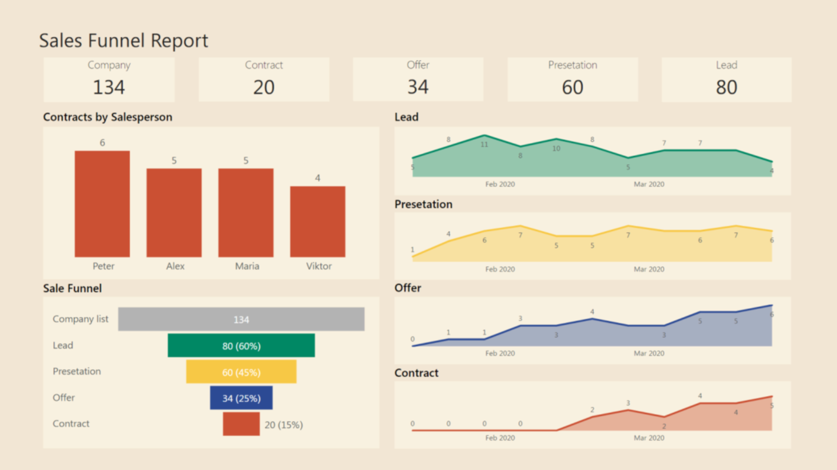
Practice with the case study "Sales funnel"
Rules of color coding and accent placement.
Creating cards for totals. Lifehacks of data preparation
Building non-standard charts: waterfall, trimap, funnel, range, and others.
How to bypass the limitations of summary tables and Get pivot data.
Practice with the case study "Sales funnel"
Types of dashboards: operational, analytical and strategic. Differences in perception of the target audience.
Distribution of information by levels, working with modular grid, analysis of typical errors.
Practice with case "Dashboard for technical support".
Distribution of information by levels, working with modular grid, analysis of typical errors.
Practice with case "Dashboard for technical support".
Requirements process, iterative BI project model, roles in the team
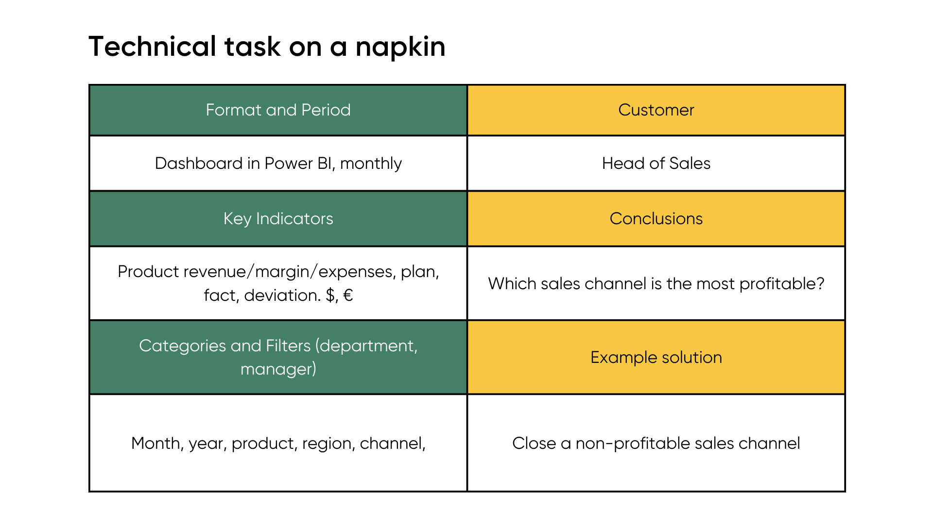
Setting tasks for "graduation works", fixing requirements according to method "technical task on napkin".
Setting tasks for "graduation works", fixing requirements according to method "technical task on napkin".
Advanced course
Creating a list of fields from multiple tables. Setting up links, the concept of directories and keys, star and snowflake schemes
Working with Power Pivot add-in, culture of data model design
data model
Working with Power Pivot add-in, culture of data model design
data model
Basic steps of working in Power Query. History of transformations, canceling and editing steps. Options for uploading finished data to the outside.
Data transformations (pivot-unpivot), transpose, split columns, remove errors and duplicates.
Creating directories and calendar via Power Pivot.
Data transformations (pivot-unpivot), transpose, split columns, remove errors and duplicates.
Creating directories and calendar via Power Pivot.
Streaming data loading from multiple files of the same type, from different sheets (merge, append), error control.
Connecting data from web sources, typical scenarios of updating data from Google tables and survey forms.
Connecting data from web sources, typical scenarios of updating data from Google tables and survey forms.
DAX syntax, culture of working with measures. Basic functions SUM, COUNT, DISTINCTCOUNT, MIN, MAX, etc.
Functions iterators and aggregators. SUMX, AVERAGEX, COUNTX, etc.
Operators IF and SWITCH, handling errors with the help of functions IFERROR, DIVIDE.
Conditional calculations with CALCULATE and FILTER functions
Functions iterators and aggregators. SUMX, AVERAGEX, COUNTX, etc.
Operators IF and SWITCH, handling errors with the help of functions IFERROR, DIVIDE.
Conditional calculations with CALCULATE and FILTER functions
How to properly present a dashboard, interactive demonstration scenario. AIDA methodology
Consolidation of the material about dashboard design, modular grid, levels.
Training participants present their projects according to the AIDA methodology. Invited managers give feedback.
Consolidation of the material about dashboard design, modular grid, levels.
Training participants present their projects according to the AIDA methodology. Invited managers give feedback.
Leave a request and we will send you the program to your email!
TRAINER - ALEX KOLOKOLOV
Power BI professional and fan of data vizualisation
Power BI professional and fan of data vizualisation
300+
reports designed
8500
people trained
14
years in BI


HOW WE WORK
Flexibly Finding the Balance Between Consulting, Design and Integrations
Participants create a final project, including developing a dashboard for your company, applying learned knowledge in practice
Final Project

The program is implemented through online training, utilizing interactive methodologies and modern educational technologies
Online Training

We develop a customized training program tailored to your business’s specifics and goals
Program Development

We study your business and conduct interviews with key employees to identify development needs
Business Analysis

WHAT YOU GET
Solution fitted to your project stage
LET’S START FROM FREE AUDIT
Get Expert Review for Your Reports and Know How to Improve Them
Alex Kolokolov
CEO & Founder at Data2Speak Inc
Contact me directly via messengers